Consulting innovation · Visual modelling
Improvement opportunities map
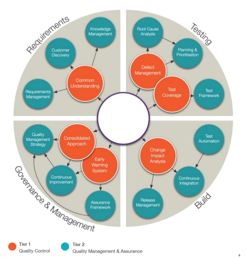
Every review produces recommendations. Most of them die in an appendix. This map puts them on one page, grouped by owner, with dependency rings showing which items unlock the rest.
Why
A recommendations list hides the two things a sponsor needs to know: who owns each item, and in what order they pay off. Twenty recommendations of apparently equal weight invite either paralysis or cherry-picking. Sequencing and ownership are the difference between a review that changes an organisation and a review that gets filed.
How
- One page, all recommendations, grouped by the team or vendor that owns them.
- Dependencies as concentric rings. The inner ring holds the highest-value items, the ones that unlock the second tier. Read from the centre outwards and you have the roadmap.
- One page of detail behind each item, so the map stays a map and the depth stays available.
What
Built for quality review engagements where the recommendation count outgrew any list a sponsor would act on. The map became the artefact the sponsor kept on the wall: progress was tracked by colouring the rings in, and every steering conversation started from the same shared picture instead of from a status report.