Consulting innovation · Visual modelling
Quality Integration Maps
One page that holds what the customer feels, what the business needs, and what the technology risks, stage by stage across the customer journey. Test priority set by what matters, visible to everyone at once.
Why
On a project of meaningful size, no single person understands everything that should shape test priority. The customer view lives with designers and support teams, the business view with product owners and finance, the technology view with architects. Each group prioritises from its own corner, and testing inherits whichever corner shouted last.
The gaps only become visible when the perspectives are forced onto the same page.
How
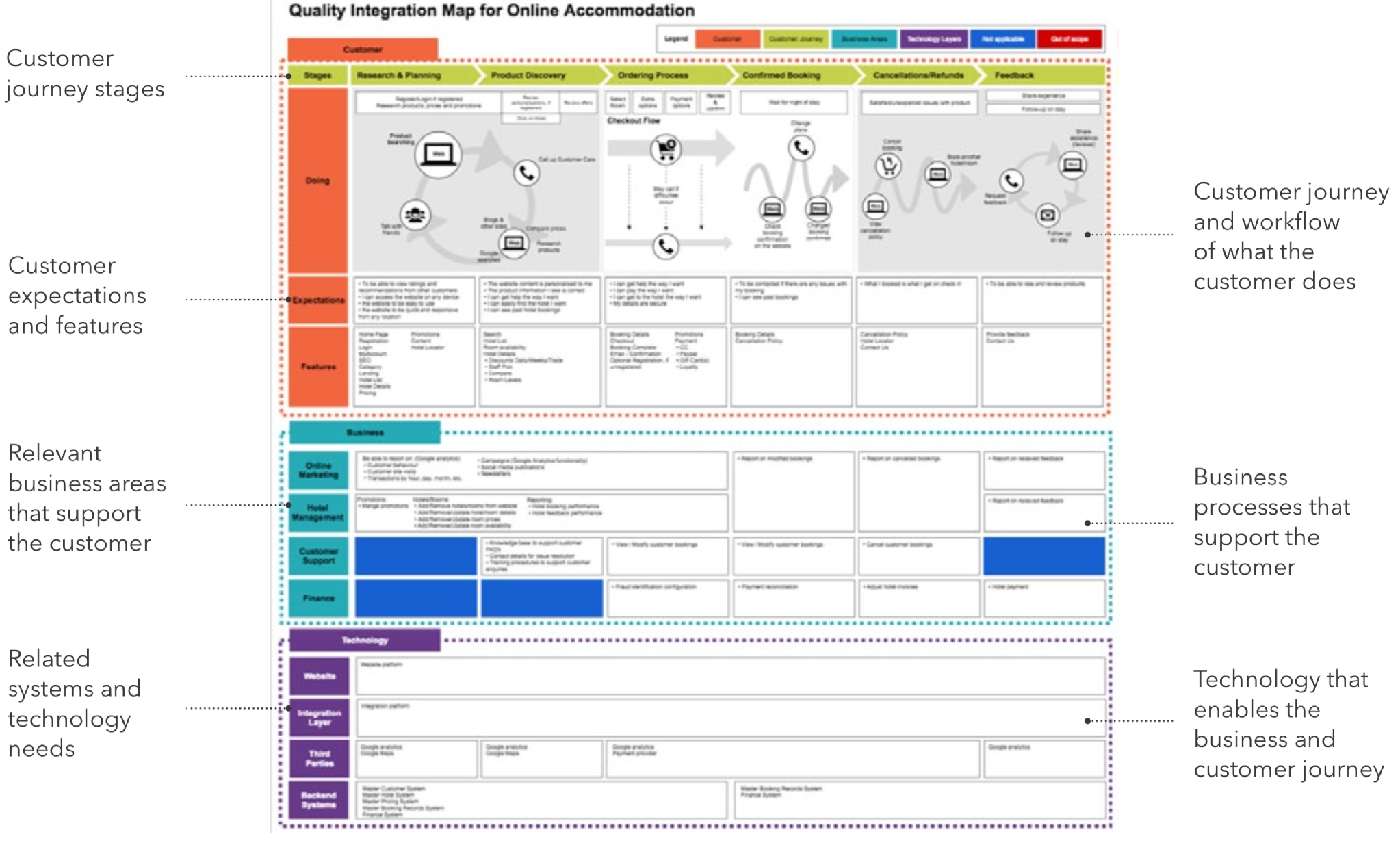
A Quality Integration Map is a single page with three horizontal lenses:
- Customer, on top. The customer journey, stage by stage, with the key personas at each stage and a light design-thinking layer: what they are feeling, what they are thinking, what matters to them right now.
- Business, in the middle. The business units in play at each stage and what each of them needs to be true.
- Technology, underneath. The integrating systems, the integration points, and the technology risks sitting under each stage.
The map is used two ways:
- Brought into a prioritisation workshop as a thought provoker, or built during the workshop as the base activity the prioritisation then runs on.
- Carried through delivery as the communication backbone: planned scope, coverage, quality outcomes, and progress are all reported against it, so it stays visible that the combined priorities of customer, business, and technology are being adequately addressed.
What
Used across engagements as the anchor artefact for risk workshops and scope reviews. The consistent effect: someone in the room sees, for the first time, an expectation or a risk owned by a different lens colliding with their own. That collision is the point. It changes the test priorities before a single test is designed, and it gives the business a version of test scope they can correct.